Overview
Websites published by academic and administrative units must adhere to Pitt’s brand standards for websites. These standards ensure our sites properly represent the University’s brand to audiences and provide a consistent and familiar user experience.
University sites should follow W3C Web standards, which include consistent use of semantic HTML, accessibility compliance with ADA section 503c, and adherence to best practices regarding usability, including responsive design, for handheld devices.
University Web Themes
While custom websites may be produced, all sites must meet Pitt’s basic Web standards. University units are encouraged to utilize one of the approved University web themes, which serve as a great foundation. The Unversity themes provide a wide range of layout options and page widgets. The UCM Web team will consult with you on how to customize your site and incorporate additional features. Please contact us to request more information or to discuss your project.
Starter HTML Template
If you are building a custom site for a University unit, please download the starter HTML/CSS template. This set of files will provide you with the correct fonts, colors, graphics, and basic HTML code for your site. Using this as a starting point will ensure consistency and compliance with basic University brand standards.
Brand Standards for Websites
University Header
The official Pitt logo must appear at the top of each page in the header element. The header may not be edited, resized, or include additional elements. It must include the correct margins and spacing. No other marks may appear above, adjacent to, or on the same horizontal plane as the University shield and signature. You may download the starter HTML/CSS template or contact us to request files containing HTML and CSS for site headers and footers. Attributes of the header include:
- Official Web version of University shield and signature justified left. The display width for the shield and signature is 135px by 42px.
Site Title/Logos
The title of the site must appear in the font Roboto. Unique unit logos are not permitted in the header space without permission from University Communications. Contact us if you feel you need a unique mark for your site. The site title may include two lines of text in order to accommodate a stacked title or the name of a parent unit. The unit name must be rendered HTML-based Roboto Medium font at 24px in height on one line or 17px over 24px Roboto Light if two lines.
Example blue header with one-line title and navigation:

Example blue header with two-line title and navigation:

Please submit a request for header files.
Fonts & Sizes
Primary font for page headers is Alternate Gothic ATF Bold; subheads are Roboto Bold; and body copy is Roboto Regular. Accent copy is Instrument Serif Regular. The width of the main page content container should be responsive with a maximum width of 1,320 pixels and 1,280 pixels for content.
Colors
Examples of appropriate use of color are demonstrated in the official graphic themes. University academic and administrative sites should not arbitrarily incorporate unique color palettes.
Background Colors
- Pitt Royal Blue: #003594
- Pitt Gold: #FFB81C
- White: #FFFFFF
- Grey: #E8E9EE
- Dark Grey: #2B2B2B

Accent Colors
- Pitt Royal Blue: #003594
- Pitt Gold: #FFB81C
- White: #FFFFFF
- Orange: #FF6600

Text Color
- Dark Grey: #2B2B2B

Link Color
- Blue: #3366FF (light background)
- Pitt Gold: #FFB81C (dark background)
- Text-decoration: none

Footer
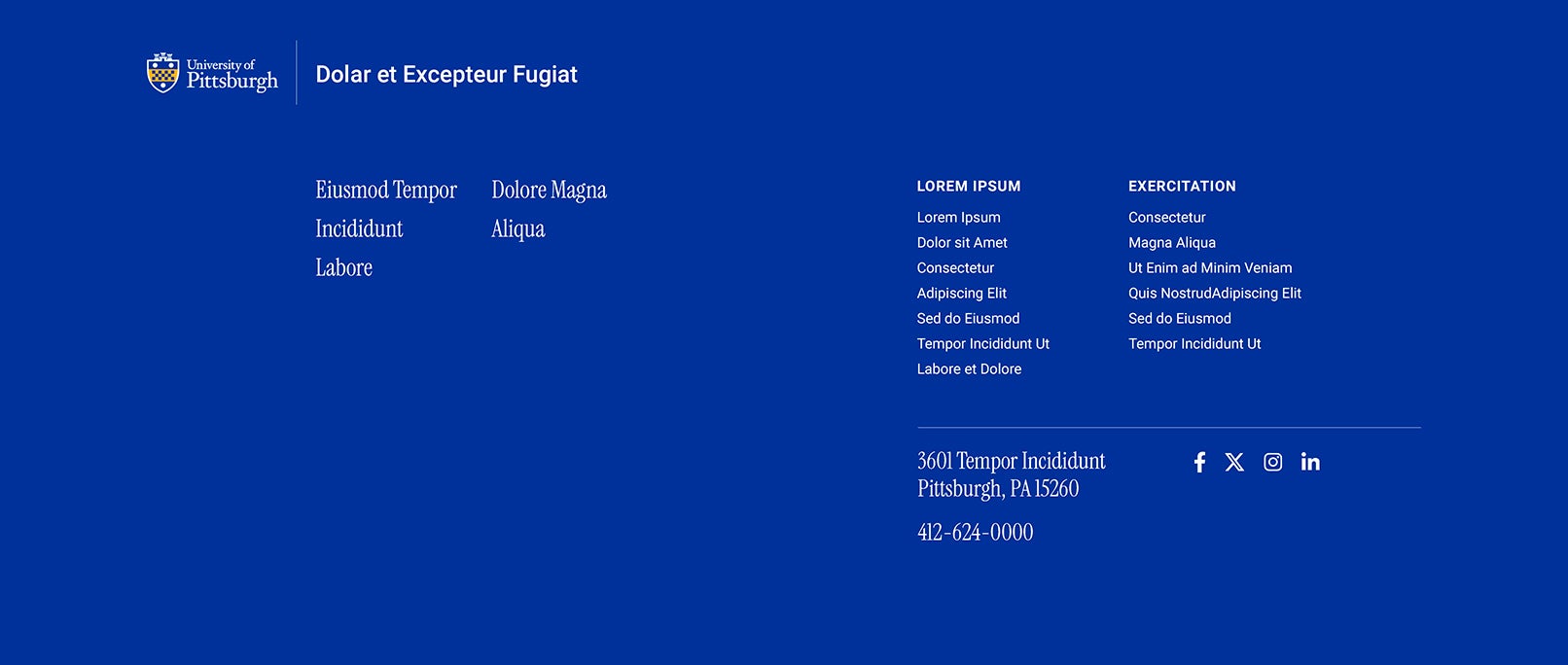
Every page should include a footer element. The footer may be kept simple or include links to forms, popular resources, social media, and other destinations. The footer background color should be consistent with the header (blur or white). When the use of a unique logo is required, the logo may appear in the footer. This page offers a good example of the standard footer style.
At a minimum the footer should contain:
- Official Unit name
- Street address
- E-mail address
- Phone Number
- Link to Web feedback form
- Revision date
